Six ways to make your consulting website look more professional

Are you a consultant or a professional service provider?
Here are 6 tips to help your website look more professional.
Professional looking websites convert better. They get more leads, they get more sales.
If your website looks professional, potential customers are more likely to trust you and purchase from you.
How do we define “professional looking”? Read on.
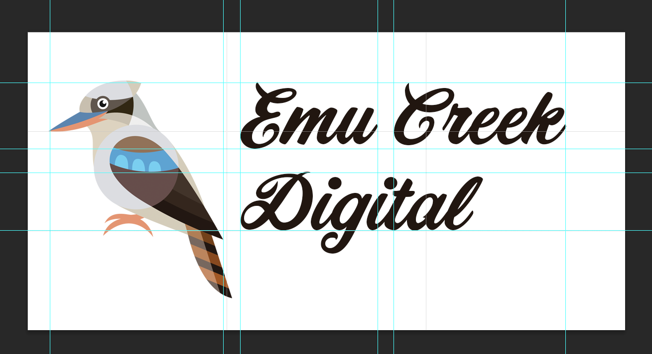
Get a logo (and/or professional branding)
If you want to DIY your own logo one way to do it is to buy an icon or graphic and a custom font and hash something out.
Custom font + icon/graphic = custom DIY logo
Make sure that you are purchasing a commercial license so that you have the rights to use the font and graphic commercially. Most stock sites will state fairly clearly on the icon/font page whether this is the case.
As an example, Creative Market is a great place to find custom fonts, graphics and even branding templates. Shutterstock is another affordable source of icons/graphics.
For your icon/graphic I would recommend going with a vector file type, for instance .esp.
When you download an image in vector format, it retains its ability to be resized without losing quality. This means you will be able to create your logo in all sorts of sizes (even billboards) without it getting pixelated.
You will need image editing software such as Adobe Illustrator, Adobe Photoshop or Canva to play around with your custom font and graphic and combine them.
Spacing is an important element to think about when it comes to logo design.
Your graphic needs room to breathe, and the elements in your graphic should align in a way that makes sense.
There are some great tips about logo spacing in this Wix article.
If all this sounds a little overwhelming to you, and you are at the stage in your business when you can afford it, hiring the expertise of a Brand Designer is totally a worthwhile investment.
Brand designers can often wrap up the following elements discussed above in an all-encompassing brand guidelines package:
logo formats (eg. submark, inverse/reversed)
Fonts
Colours
implementation guidelines
Nothing says “you can trust me” like professional branding!
ECD is not a brand designer, however we do work with some fabulous brand designers.
Examples of brand designers we love:
2. Add a favicon
Once you have a logo, it’s time to devise your favicon.
A favicon is the little icon that sits in the top left of your browser window.

A favicon should be a simpler version of your logo or an aspect of it, since it’s going to appear super tiny and any great detail would be lost.
A favicon has a square ratio. Typically 100x100 pixels or 300x300 pixels is a good size to make your favicon, as it can be used as a browser shortcut icon on mobile home screens.
Your CMS (Squarespace, Shopify, Wordpress) will automatically resize your favicon for you into the web display size which is 16x16 pixels.
I would recommend to save your favicon as a png file type, this will allow you to have a transparent background if you wish.
Here are some instructions on how to upload favicons on common website platforms:
How to upload a favicon in Shopify
3. Have a consistent colour palette
Now that you have your logo and favicon, it’s time to choose a colour palette for your website.
When it comes to your website, it’s good to have approximately 3-5 colours that you can rotate through to keep your website looking professional and consistent.
These colours should complement your logo. They may include colours from your logo.
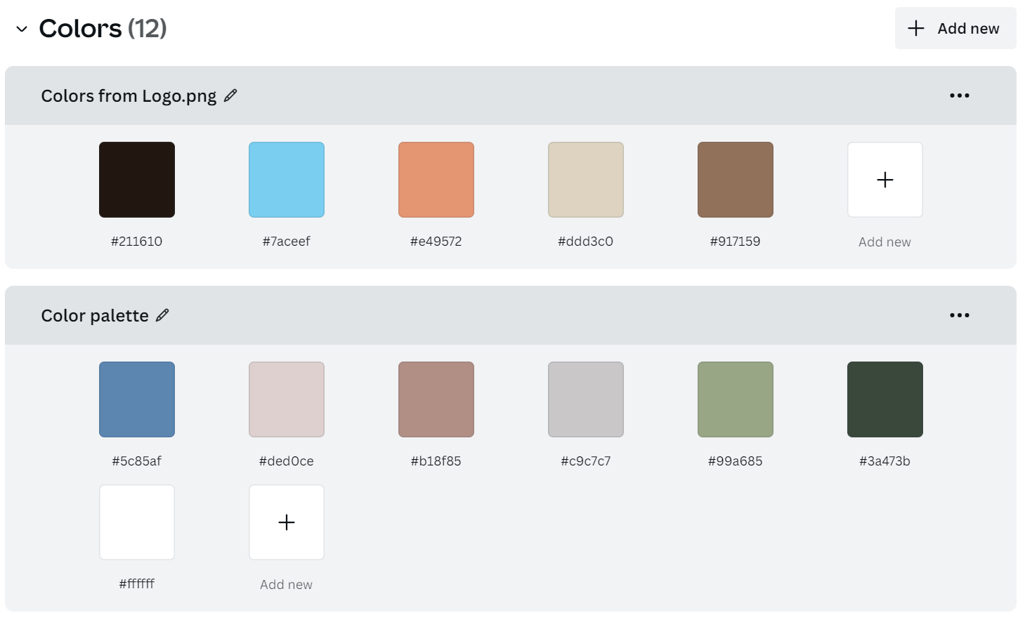
These colours should include some subdued colours that you can use for backgrounds, whites or greys can be useful to include.
The palette should also include some highlight colours that you can use for buttons, links and calls-to-action.
Use bright colours thoughtfully, less is more.
The highlight colours should have good contrast on your subdued colours for legibility and accessibility reasons. You can use a contrast checker to make sure this is the case.
A good rule of thumb can be: two background colours and three highlight colours to make up your 5 colour palette.
Our favourite tools for creating website colour palettes include:
https://coolors.co/ - this website can pick colours out of an image or logo and create PDFs for you to export so that you have your colour palette on file.
https://colorhunt.co/ - features beautiful colour palettes picked by designers
Site Palette Chrome Extension - for pulling colour palettes from websites that you like, for inspiration
Adobe Colour Palette Generator - as per coolors, this tool can also generate suggested colour palettes from images
4. Consider typography
When designing your website, you should consider font-pairing.
That is, what fonts you are going to use for your body text and what fonts you are going to use for your heading text.
Great fonts are one of those subtle things that make a website look really polished on a somewhat subconscious level.
You want fonts that are elegant, legible and match your industry. For instance Comic Sans, quite a childish looking font, would not really be a suitable font for a doctor.
I did actually once receive an invoice from a surgeon in Comic Sans, let’s just say he had a monopoly on the local market.

But surely that doesn’t mean he couldn’t shell out a little money on a local graphic designer to look more professional, right? Hopefully he is not being stingy on anything surgery related!
Professional = trustworthy.
Trustworthy makes your patients (or clients) feel like they are in safe hands!
Some great sites for font pairing are:
https://www.fontpair.co/ - lovely pairings of free fonts
https://fontjoy.com/ - generates font pairings using machine learning
How to adjust your header and body fonts on some common website platforms
5. Use high-quality images (get professional photography if you can afford it)
What defines a high-quality image?
An image that is:
Relevant to your business/product/service
Bright, sharp and clear, not pixelated
Cropped appropriately
Loads quickly
Has good composition
Has good lighting
You can use stock images, you can use images that you have taken yourself or you can use professional photography.
A professional photoshoot is well worth the investment.

Benefits of using a professional photographer:
Helps you put your brand’s look and feel and even your brand’s colour palette into your photos
Makes you feel at ease
Edits your photos to a high standard
Provides you with a library of images that will keep you going with content for your social media for a while!
Can smash out product images for you and/or give you advice on setting up a photo booth and lighting for products
Can provide you with an all-important professional headshot (so people can see who’s behind the brand, again to build trust)
Even if you don’t like having photos of yourself taken, professional photos that prove you are a real person build trust. There is never a “perfect time”. Bite that bullet!
Examples of brand/commercial photographers we love:
6. Use clear concise messaging (use a professional copywriter if you can afford it)
There is no point having a beautiful website if your copy or calls-to-action don’t communicate your message.
Brainstorm some basic talking points for each page.
One point I’m passionate about is that:
Copy should come before layout design.
Once you know what you want to say, you or your designer can lay out the page to best communicate the text and message.
Keep your text short and punchy. Break it up with headlines, sub-headlines, lists and images.
People do not tend to read slabs of text on the internet.
Ask yourself some basic questions:
Do my customers understand what I sell?
Am I speaking in their language? (No jargon)
What is my point of difference from my competitors?
Why does my product/service exist?
What problems does my product/service solve?
What does my brand/company stand for? (People are attracted to people with similar values. Eg. Earth Greetings plants a native tree for every order placed, this aligns with their beautiful products, which often feature native prints)
What will my customers get out of doing business with me? (Think tangible but also intangible eg. personal values, doing business with someone local )
Here is a good template for helping you write website copy:
https://www.bigpicturebranding.com/blog/homepage-copy-template
Website copywriters we love
In conclusion
That’s it, 6 areas that are vital to a professional looking website that converts.
It can be overwhelming to do everything at once, but even if you pick one thing and focus on that as a first step: branding, copywriting, website design or photography.
Then go back and pick one of the others, start a cycle of continuous improvement.
Have you changed any one of these particular areas on your website and seen results? Or maybe not?
Let us know in the comments below.